About
A case study of the e-commerce site White Spatula.
A upgrade was needed as the company was working off a dated design that did not reflect the modern UI/UX principles.
Redesigned as part of project during General Assembly studies
WORKFLOW
Ideation
Sketching
User/Wire Flow
Wireframe
Synthesizing
Key Insights
User Persona
Information Architecture
Research
Benchmark
User Interview
Affinity Mapping
Prototype
Usability Testing
Iteration


FINAL LOOK

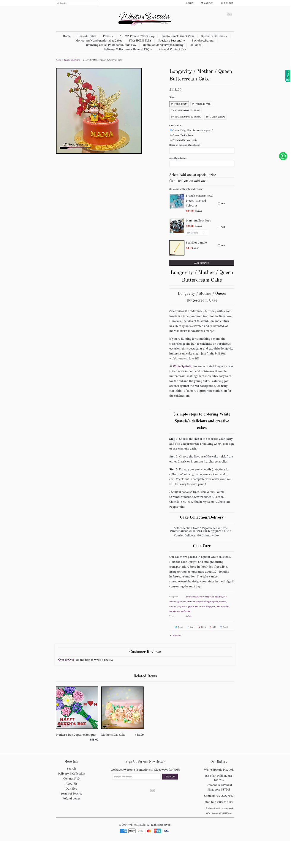
ORIGINAL LOOK
RESEARCH
COMPARATIVE/COMPETITIVE ANALYSIS
A few best-in-class sites were chosen to understand the strengths and possible improvements


INTERVIEW KEY FINDINGS
Interviews were conducted with 10 users on the topic of purchase both offline and online
Here are 3 main sentiments drawn from synthesizing the participants habits
They prioritise speed over choosing specific premium branding
1
Users want to avoid wastage due to overordering
2
Automated check-out systems helps with decisive purchase
3
GENERATING USER PERSONAS
Identifying the needs and wants of our users

I hope the cake ends up looking like what I want
Merry Molly
-
wants easy customisation process
-
needs to order to size

TLDR, too much text, I just want it all in a packet so I can buy it on the spot
Lazy Larry
-
likes boxed up information
-
lazy and wants premade options
Majority of users who shop at stores similar to White Spatula end up procrastinating and require ways to shorten the check out process
However...


Users place importance on occasions like birthdays and plan accordingly in advance to make sure they get the exact product they want
I assumed...
The current site
Here are some of the features that could benefit from upgrades
Global Navigation
The current site has
15
Main Categories
Product Page
Each page has only
1
Secondary Navigation
Product Details
There is
NO
Cake Sizing Guide
Product Options
Product pages have
LIMITED
Selectable Options

Header

Product Description

Cart/Check Out
Other observations
-
The product cards were of varying thumbnail sizes and different length of descriptions
-
Customisation of products were input manually by the user instead of options they could pick
IDEATION
Wireflow - Sketch
A sample flow of the user journey in checking out a cart
Proposed Sitemap
A cardsort was conducted to determine the major groupings perceived by users

STYLE GUIDE
Following the original branding closely, fonts and colours were picked out

SOLUTION
Based on the research, the following solution was synthesized


-
Sets were compiled into selectable options
-
Icons were included to visually aid users
1. Balloon Set
2. Cake Customisation
-
Laid out in a step-by-step process
-
Cake size guide was included for clarity
PROTOTYPE


NEW
OLD
ITERATION
5 usability tests were carried out to hear our users thoughts


3/5 users felt that the icons were not enough to visualise the product
Solution: Add product photos to options


Solution: Have an automated side pop up after they add items to cart
4/5 users was unsure whether their item had been added to cart
ISSUE #1
ISSUE #2
NEXT STEPS
Going forward
-
Continue user testing after iterations
-
Think of ways to retain users on the website (gamify options)
-
Conduct more comparative analysis to think outside the (cake) box
-
Look into further streamling the checkout process


